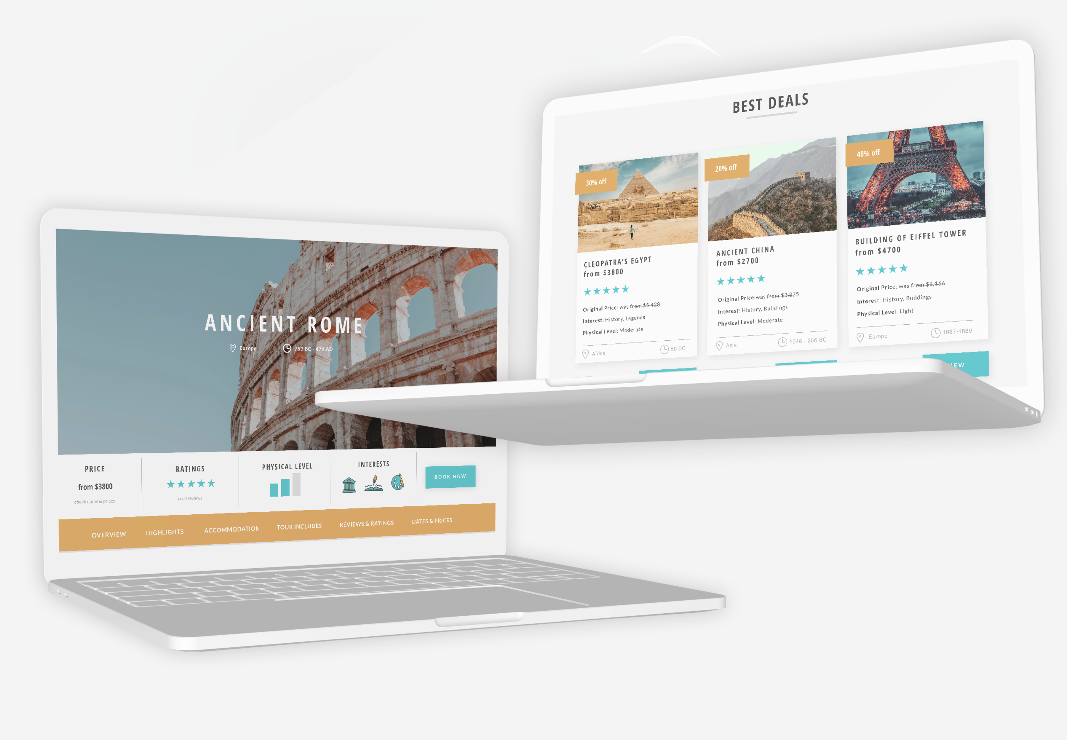
Zeit

    E-commerce Responsive Web Design

    My Role: UX/UI Designer: UX Research, Information Architecture, Visual Design, Interaction Design, Usability Testing

    Client: Zeit*

    Team: Self-directed (with expert mentor support and group crit feedbacks)

    Prototype: View prototype in Invison

    Time Period: March - May 2019

    *Zeit is a fictional company

    About the project

    Background

    Zeit is a subsidiary of Richard Branson’s Virgin empire. After a long struggle with Elon Musk, Virgin has been able to make time travel tourism available to all with Zeit. A total of 289 destinations all over the world, up from prehistoric times through today, have been approved and finalized to receive people any moment. Zeit wanted to make the selling of the tickets as easy as possible.

    Project Objectives & Goals

    • Design a responsive e-commerce website that is easy to use and that allows customers to browse through all different trip categories and details, filtering via interests and classifications
    • Design a logo for the company that can be modern and historical at the same time

    Process

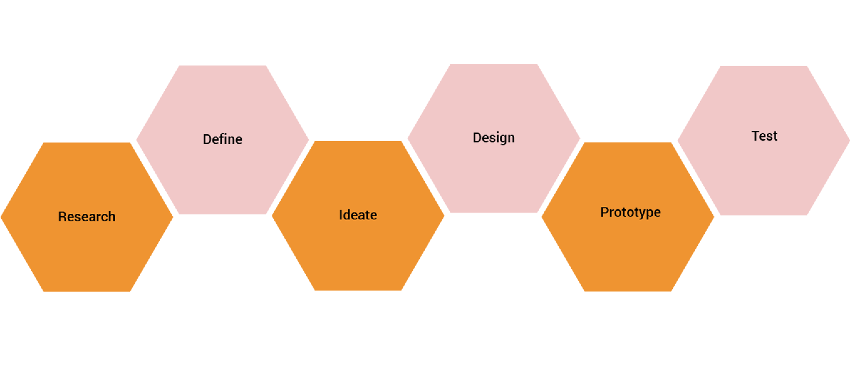
    01.Research

    Goal: To research the current travel market and audience of online travel booking websites

    Process: Market Research, Competitive Analysis, User Interviews

    Market Research

    I conducted a market research to get a better picture of the tourism field and consumers. Since Zeit is the very first time travel website, I couldn't gather already existing information of the time travel industry, which was very challenging. However, by focusing on the ordinary travel industry, I gathered valuable market and demographics findings that are rooted in data and statistics. I could collect the common trends and pain points of online travel booking websites as well. This secondary research method allowed me to gain an understanding of potential needs of travelers.

    DEMOGRAPHICS:
    • Global luxury travel is popular among the millanials
    • Millanials are 13% more likely to travel to a destination with cultural or historical significance
    • Baby Boomers (aged 50+) are active travelers
    • Generation X is price sensitive and exploration hungry
    • Solo traveling is surging and over 40%

    TRENDS:
    • Travel booking on mobile continues to grow but laptop bookings are still more popular
    • Social media influences travel plans
    • 74% of domestic trips are for leisure purposes
    • Personalized trips are preferred by 57% of travelers.
    • More than 60% of U.S. travelers would consider an impulse trip based on a good hotel or flight deal

    Competitive Analysis

    By analyzing direct (Exodus Travels, Secret Compass, Wild Frontiers) and indirect competitors (Kayak,Travelocity), I understood how other travel booking websites design for their users and how they solve problems for similar user needs. I identified a few direct and indirect competitors and pointed out their strengths and weaknesses in order to be able to position Zeit in the market.

    User Interviews

    To gather qualitative information and empathize with users, I conducted user interviews as my primary research method. I interviewed 7 frequent travelers and asked mostly open-ended questions about their travel and booking experiences. I could highlight common and very similar needs, desires and frustrations among the participants' answer, which helped me understand user habits, behaviour and feelings better.

    View Interview Script

    Interview Participants

    • Number of interviewees: 7
    • Gender breakdown: 5 females, 2 males
    • Travel frequency: 6 of the participants travel minimum 3-4 times/year
    • Age: 20-63

    02.Define

    Goal: Synthesize research to define the target audience - and their needs, frustrations, goals

    Process: Empathy Map, Persona

    Empathy Map

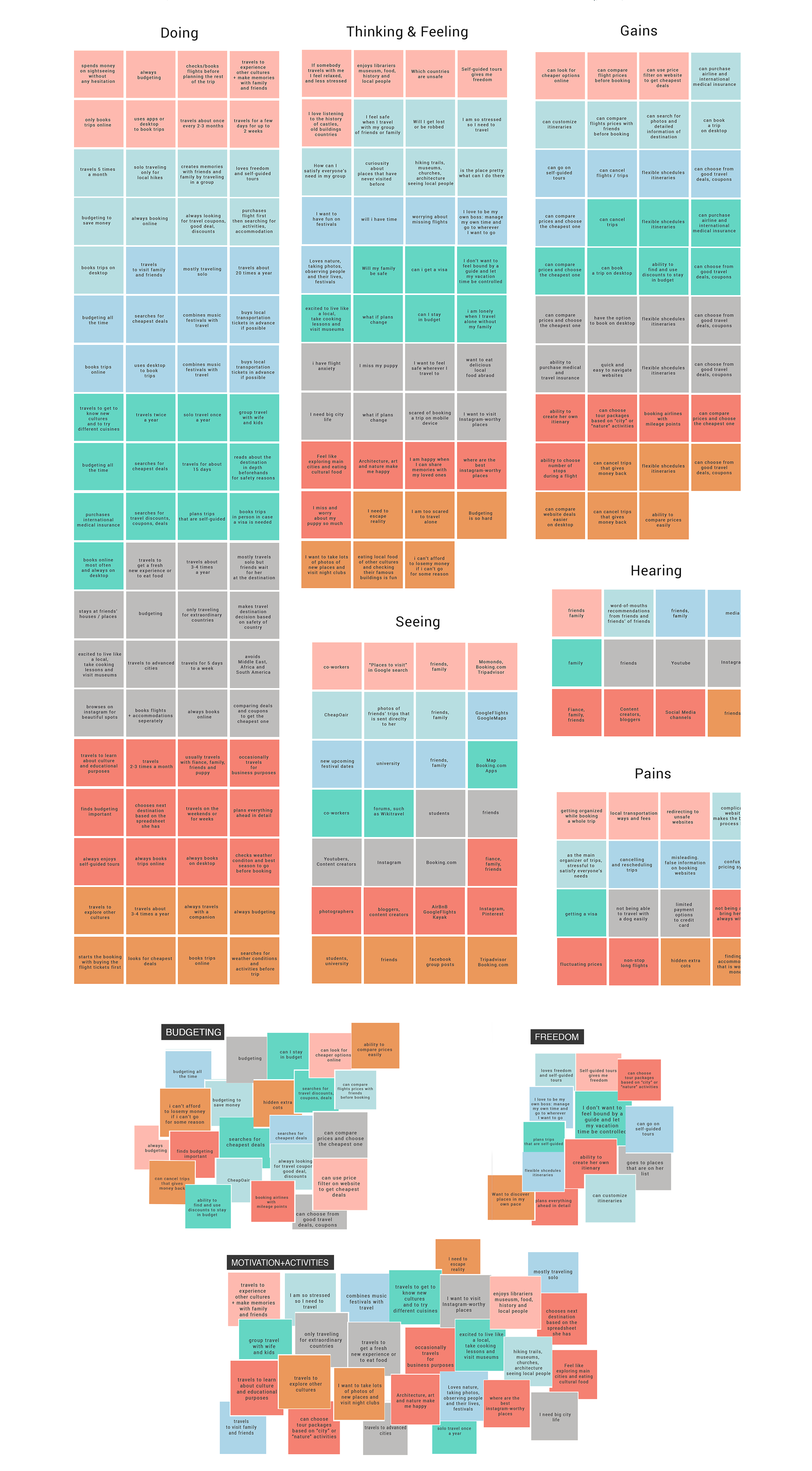
    To synthesize my findings, I created an empathy map to help me understand my observations from the 1:1 user interviews and to identify patterns that were common across most participants' answers. I grouped the observations into different categories: doing, thinking&feeling, seeing, hearing, gains & pains - for each individual person then common patterns were further categorized into different groups, which is how I developed key insights. Finally, based on these insights, I could identify the user needs.
    Insights

    • Participants seek different activities to do during their trip
    • Participants desperately want to stay within their budget
    • Participants love going whenever and wherever they want to go

    Needs

    • Participants need to be able to choose experiences based on different interests
    • Participants need to know that they spend the best out of their budget
    • Participants need the ability to be in control of their trip

    User Persona

    Based on the empathy map findings, I created a fictional user persona, "Luna", who represents the key audience of Zeit. My user persona helped me find the answer to one of the most important questions: “Who am I designing for?”. By creating "Luna", who has the needs, goals, and observed behavior patterns of Zeit's target audience incorporated into her, I was able to strategize and make smarter design decisions.

    03.Ideate

    Goal: To generate ideas about the information architecture of the website and map user flows

    Process: Card Sorting, Sitemap, Task Flow, User Flow

    Card Sorting

    I conducted an open card sorting technique with 5 participants to see how potential users organize content naturally and to uncover new perspectives. I asked the participants to group 30 cards in any way they wanted to. Then I analyzed the results and was looking for strong card pairings and potential groupings using the similarity matrix and dendrograms (best merge method). I was able to understand how users organize information so I could create a successful information architecture for Zeit.

    Findings:

    • Most participants grouped cards based on location (continents), time period (eras) and culture
    • Most participants grouped cards generally on the era as well
    • 3 participants created a category specifically titled as US History / Events

    Site map

    Based on the card sorting results and common e-commerce design patterns, I created a sitemap, which is a hierarchical diagram visualizing the structure of Zeit and the relationship between the content. By creating the sitemap, I was able to ensure that the content is in places where users would expect to find it.

    User Task

    Next, I created a task flow to visualize the complete path that a user follows during a single task. Finding information about the company and to look for a specific trip would be completed by the users in a very similar way or same way.

    User Flow

    To have a deeper understanding of how users would interact with the website, I built a user flow diagram, whichemphasizes how Cholette can navigate through the website to reach her goals. I built out the journey of Luna how she is trying to find the best deal out of all and the second scenario showcases Luna's journey of finding the most ideal trip for herself.

    04.Design

    Goal: To design the user interface and branding

    Process: Low-fidelity Sketches, Mid-fidelity wireframes, Brand style tile

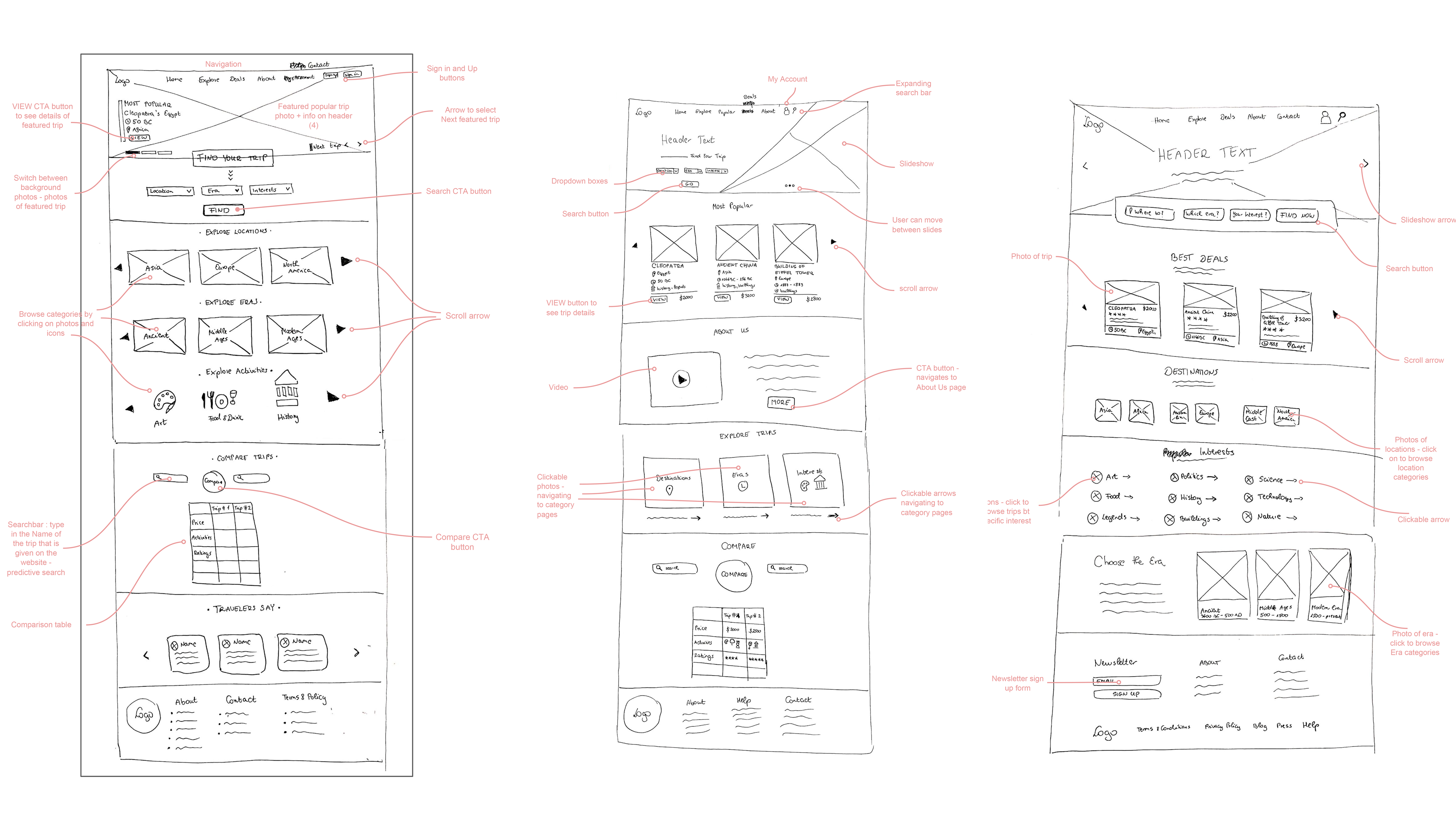
    Low-fidelity Sketches

    As the first step of designing the interface of Zeit, I created a few different low-fidelity sketches of the Homepage to go through some ideations regarding mainly the navigation, content and layout of the website based on my insights. By sketching my ideas out on paper first before going digital, it allowed me to brainstorm multiple visual directions quickly and efficiently before sticking to one.

    Mid-fidelity wireframes

    Next, I digitized the wireframes in Figma and had them as visual guides that represents the skeletal framework of the pages of a Zeit. The Homepage, Deals page and Trip Details pages were wireframed first as these pages are necessary for the trip browsing and choosing experience. The wireframes are responsive, which means that Zeit is optimal for viewing on a wide range of devices & web browsers (mobile, tablet, desktop).

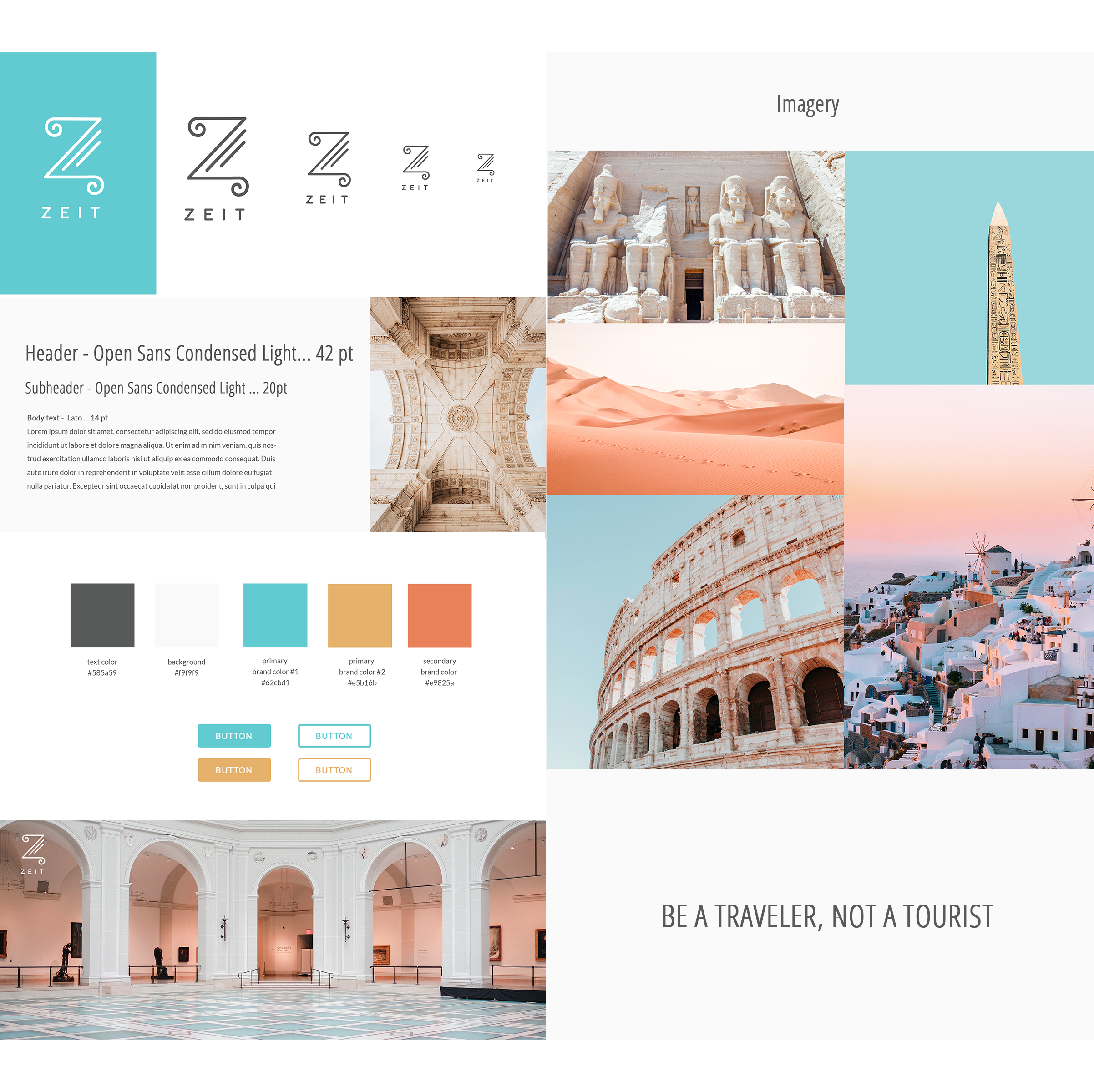
    Brand Style tile

    I started building Zeit's visual identity by identifying the main brand adjectives that would represent the company: Modern, Historical, Bright, Friendly, Innovative, Fresh. I browsed on Pinterest for some inspiration and created a mood board to have a collection of different kinds of inspiration for the look and feel of my website. The brand style tile was helping me to keep consistency in my design and to showcase the color, typography, image and logo choices for Zeit's brand.


    As for the logo and the entire logo creation process, I started brainstorming based on the brand adjectives and I incorporated elements of the ancient pillar,clock/time and old ancient paper into it to have it historical but modern at the same time.

    05.Prototype

    Goal: To build an interactive prototype that can be tested by users

    Process: High-fidelity wireframes, Prototype in InVision

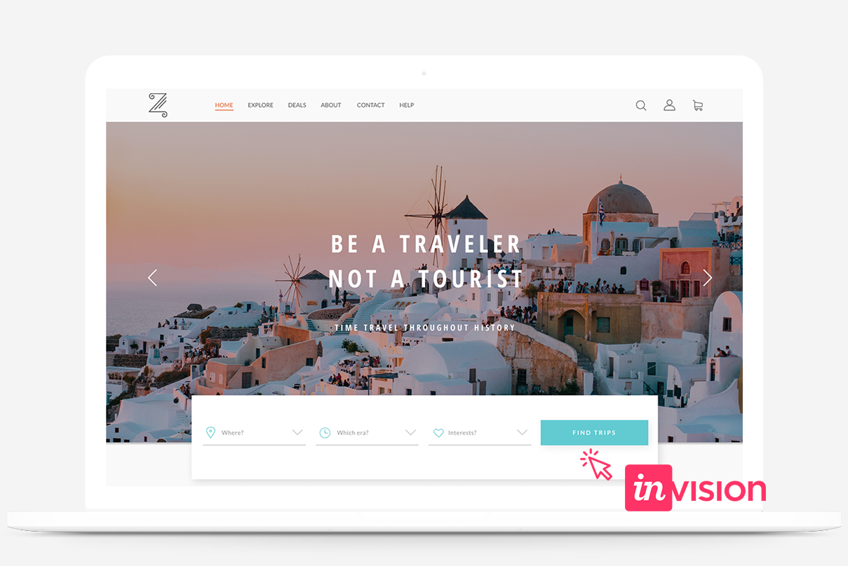
    Prototype + High-Fidelity Wireframes

    I added the visuals to the mid-fidelity wireframes and then I exported these high-fidelity wireframes of each pages into InVision to build an interactive prototype by using hotspots and I designed additional pages that were necessary for an efficient user flow. The prototype was built to investigate the problem solutions that I generated. After brushing up on my prototype, which had a limited funcionality, I prepared it for usability testing.

    06.Usability Testing + Iteration

    Goal: To test how well the prototype solve the problems

    Process: Usability Test, Affinity Map, Priority Revisions

    Usability Test

    I conducted an in-person usability testing with 5 participants to see how users interact with the product and to find out how well it solves the problems. I needed a test plan to guide me before I conducted the test so I identified the test objectives, the subject, chose the test methdology, defined paticipants and two different scenarios with a few tasks to complete.

    Test Objectives

    • Determine if participants are able to complete certain tasks
    • Identify any usability problems
    • Observe the performance of participants and evaluate how satisfied they are with the product
    • Identify possible changes that might improve user performance and satisfaction
    • Identify the way participants navigates through the website to achieve their goals

    User Tasks

    • Look for deals on the website and possibly try to find the cheapest deal then check the details of that trip
    • After some time of browsing the deals, you decided to travel back into the Ancient Times. Compare to each other 3 trips (that belong to the Ancient Times) to help you decide which one matches your taste more
    • Try to find this specific trip that you have in mind by using the search bar on the homepage and check the details of this offer! (Opening Day of Disneyland, 1955)

    Results

    After reviewing the videos that I recorded of the participants while completing the given tasks, I put together a document of how the participants completed each tasks, what I observed and what they said or recommended regarding the prototype.
    View Test Findings

    Affinity Map

    Next, I created an affinity map where I gathered the findings from the usability testing and sorted the feedbacks into different categories. Based on the insights and recommendations, I was able to create a guideline to the priority revisions on my prototype. The affinity map helped me find out what could I could improve on the website for a better user experience.

    Insights:

    • Users need the Sort By function but it was hard to notice it right away.
    • Users need to be able to sort deals by time periods (eras).
    • Users need to be able to sort trips by location.

    Recommendations (high to low priority):

    • Make changes to the SORT BY section to have it more visible for users with additional sort options.
    • Update the Best Deals carousel on the Homepage to navigate the users to the Deals page itself from there.
    • Add a filter feature

    Iteration

    After having prioritized the recommendations in the affinity map, I updated the website design and prototype. I implemented changes to the "sort by" function on the Deals page and also added a filter function as well. On the homepage I removed the carousel in the Best Deals section and added a new CTA button, which navigates users to the actual Deals page. The previous and revised versions of the Deals page and Homepage are shown below.
    Interact with the Prototype here

    Handoff - UI Kit + Zeplin

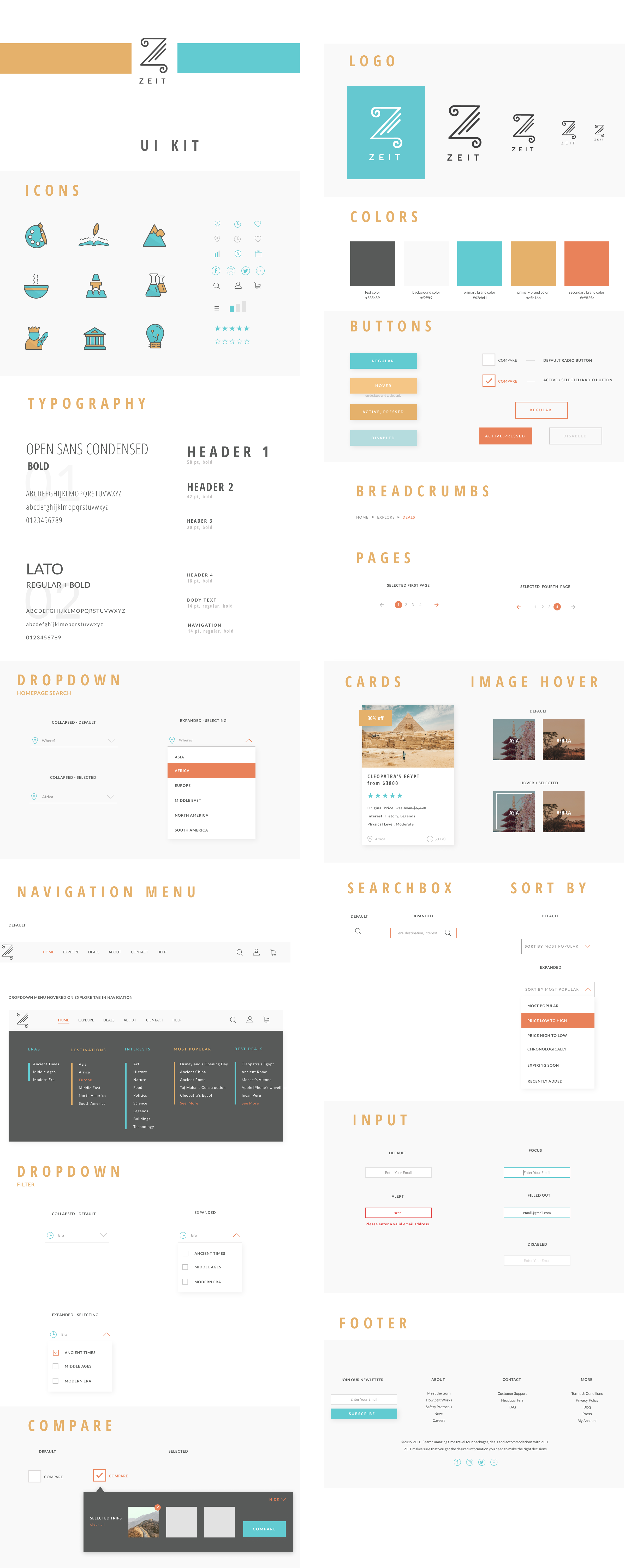
    I put together a UI document to share UI elements and patterns with other designers or develpers on the team. I designed all of the associated states of certain comps, how certain elements behave when they are active, inactive or hovered over. Then with the help of Zeplin, I prepared handoff delieverables to make my design work as clear and understandable for a developer as possible.

    Reflection

    Overall, I gained a great understanding of how important it is to empathize with potential users on a deeper level in order to design a successful product. I also gained valuable knowledge about designing an e-commerce website. Since Zeit is a time travel website, this project was quite challenging as I had to find my way to create a product that has never existed before. I do believe that this project helped me prepare a bit for how to identify and solve problems in any innovative environment.

    Next Steps

    • Build more pages and update prototype.
    • Build responsive pages to the new desktpop ones designed.
    • Keep making improvements on the design based on user feedbacks for a better user experience.

Copyright © 2019 szanilee.com.
Website Design & Development by Szani Lee.