Zeit: Time Travel
    Ecommerce Responsive Website

    Role: UX/UI Designer and Researcher

    Client*: Zeit - a subsidiary of Virgin empire

    Tools: Figma, InVision, Photoshop, Illustrator, Zeplin

    Prototype: Click to watch the prototype in InVision

    Time Period: April - May 2019

    *Zeit is fictional company and it is a project that I worked on during my UX Academy course.
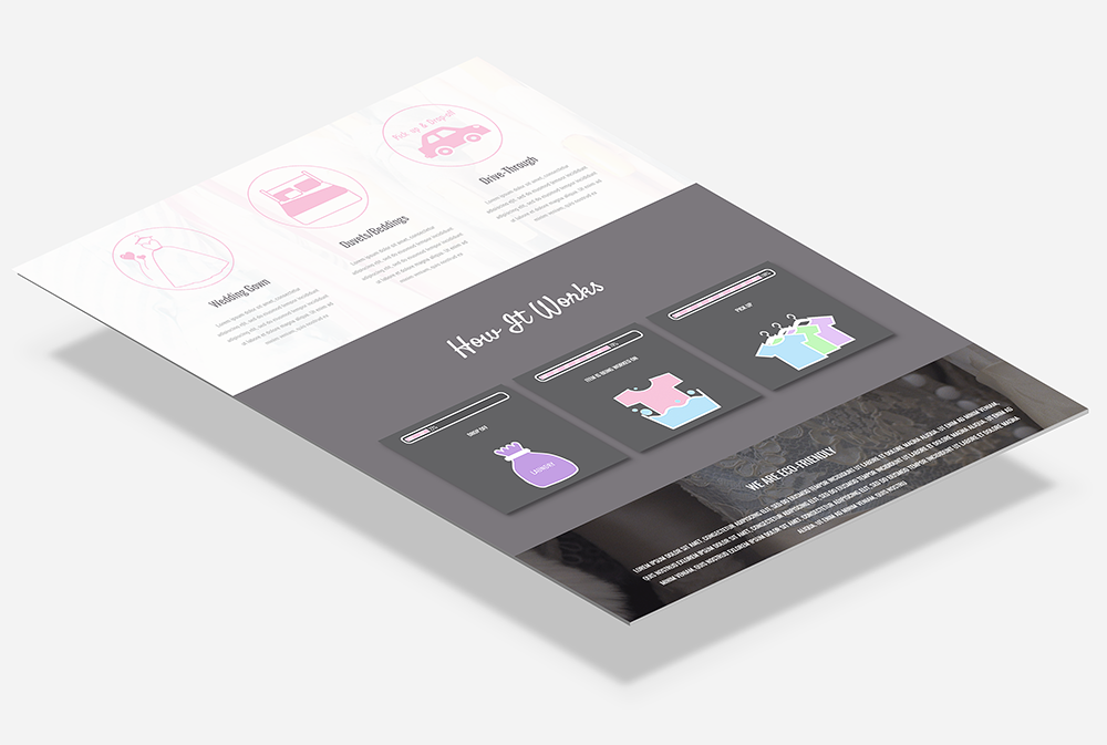
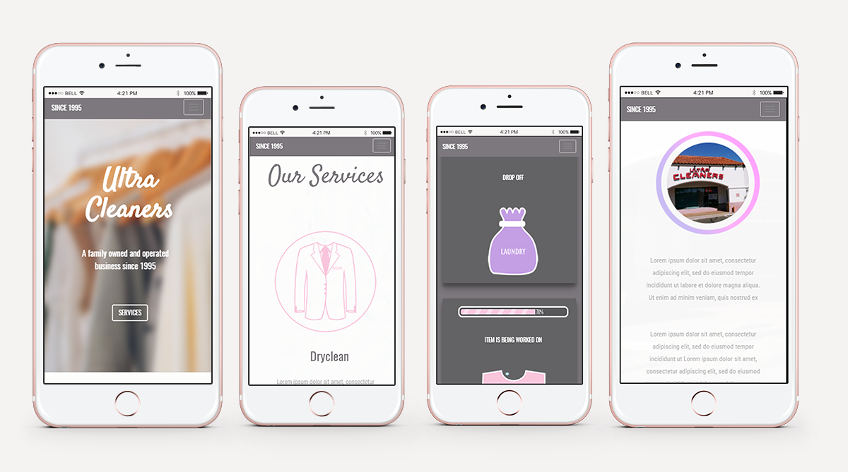
    About the project.

    Background

    After a long struggle with Elon Musk, Virgin has been able to make time travel tourism available to all with Zeit, which is a subsidiary of Richard Branson’s Virgin empire. A total of 289 destinations all over the world, up from prehistoric times through today, have been approved and finalized to receive people any moment. Zeit wanted to make the selling of the tickets as easy as possible. Think about what you know today as travel agency packages - something like that! .

    Project Objectives & Goals

    • Design a responsive ecommerce website that is easy to use and that allows customers to browse through all all different trip categories and details, filtering via interests and classifications
    • Design a logo for the company that can be modern and historical at the same time

    02. Art Direction

    Typography


    Satisfy

    A B C D E F G H I J K L M N O P Q R S T V W X Y Z
    0 1 2 3 4 5 6 7 8 9
    . ; ! < > $ @ % = /

    Oswald

    A B C D E F G H I J K L M N O P Q R S T V W X Y Z
    0 1 2 3 4 5 6 7 8 9
    . ; ! < > $ @ % = /

    Roboto Condensed

    A B C D E F G H I J K L M N O P Q R S T V W X Y Z
    0 1 2 3 4 5 6 7 8 9
    . ; ! < > $ @ % = /

    Color Palette

    #7c787d #f7c5dc #cc99d1

    Illustrations & Icons

    The purpose of custom illustrations & icons on the site was to create unique visuals.

    03. WireFrame

    At first I created the website's wireframe. I was focusing on showcasing the website's layout, the hierarchy of the content and the interaction of the user interface. The flat layout is easy to navigate on - by just scrolling up and down - so the user doesn't get lost in the unnecessary many pages. The sticky navigation bar on the top helps the visitor guide himself quickly on the website.

    The main goal was to faciliate efficiency and usability as much as possible with a simple and very clean look.

    04.Responsive Website Design

    Website Landing Page

    With the smart use of proportion-based grids, flexible images and CSS3 media queries the website is optimal for viewing on any device. Improves usability and accessability. With responsive design the layout of the page can be customized so that it is easy on the eyes whatever device the user views the site on.

    Ipad View

    Phone View

    "Alexandra was able to portray our business message beautifully and effectively with her designs!"

    Chul Chae Lee, Ultra Cleaners Owner & Operator

    06. Website Development

    I developed the website from scratch with the use of Sublime Text code editor. Twitter Bootstrap Front-end Framework was my biggest help to create a visually-coherent website that is responsive and cross-browser compatible.

    Developer skills used for this project:

    • HTML5
    • CSS3
    • Javascript
    • JQuery

    S Z A N I L E E

Copyright © 2017 Szani Lee.
Website Design & Development by Szani Lee.
All Rights Reserved.